I find it hard to figure out my own creative voice, I think this is because I am still finding my main strengths and weakness's. Although, I do find many repeating concepts within my art, and I also find that I automatically draw in a certain style and genre. I always seem to draw women's faces and also a lot of horror themed work.
I have always loved horror and gore, so I find that drawing it comes naturally to me, I love creating art that is sinister and disgusting. I am sure I have found my voice in this genre, with this I feel at home and understand the features and elements needed to create a piece that is scary or weird.
I have always like the weirder and darker things in life, I think they are much more interesting and though provoking than any simple painting of a countryside or chair etc.
Although I am starting to understand my voice, I do not have the ability to chose an image of mine to show and say that that is my definite style. This is because I feel myself improving everyday and I always find new and different elements I like to add.
Thursday, 5 March 2015
The Message Behind the Concept
How can use of colour in a piece of modern illustration influence the interpretation by the audience?
I am researching in to the ways in which colour effects the way we interpret an illustration, to do this I am going to research in to Dan Mumford and his amazing illustrations.
In Fig 1 we see a piece that Dan created for Eli Roth's 'The Green Inferno', as we can see Dan uses a limited colour palette in a lot of his pieces. In this piece Dan has chosen to just use deep blood red's and pitch blacks, this creates a very dark and sinister atmosphere. Through these colours we are shown blood shed and pain, and the dark silhouettes create a ghostly outline of humans among the disasterous and distressing surroundings. Using this colour palette Dan has communicated these feelings to use so that we are drawn in to the atmosphere and understand the setting.
In this piece (Fig 2) called LV-223, based on the Ridley Scott film Prometheus we have a surge of icy blues that radiate from the centre of pitch black, this colouring illuminates the vast surroundings and the tiny figures that stand below.
The blues portray a very cold and lonely atmosphere, I think this works beautifully with the vast empty landscape. As there are the only two humans in the whole area it adds to that feeling of a new alien place. A place that seems barron and empty of all living creatures, a truly terrifying idea, an idea that creates the feelings of solitude and being lonely or even lost. The colour scheme enforces this idea in a cool atmosphere, and the colouring used for the light creates the idea of how huge the planet it, and how cold and empty.
By this we can see how important colour can be to an illustration, it is a way of showing the audience what you want to show them, and manipulate their thinking so that you pull them in to the piece and make them feel the feelings created by the piece in large magnitude.
 |
| Fig 1. The Green Inferno. Dan Mumford 2014 |
I am researching in to the ways in which colour effects the way we interpret an illustration, to do this I am going to research in to Dan Mumford and his amazing illustrations.
In Fig 1 we see a piece that Dan created for Eli Roth's 'The Green Inferno', as we can see Dan uses a limited colour palette in a lot of his pieces. In this piece Dan has chosen to just use deep blood red's and pitch blacks, this creates a very dark and sinister atmosphere. Through these colours we are shown blood shed and pain, and the dark silhouettes create a ghostly outline of humans among the disasterous and distressing surroundings. Using this colour palette Dan has communicated these feelings to use so that we are drawn in to the atmosphere and understand the setting.
 |
| Fig 2. LV-223. Dan Mumford. |
In this piece (Fig 2) called LV-223, based on the Ridley Scott film Prometheus we have a surge of icy blues that radiate from the centre of pitch black, this colouring illuminates the vast surroundings and the tiny figures that stand below.
The blues portray a very cold and lonely atmosphere, I think this works beautifully with the vast empty landscape. As there are the only two humans in the whole area it adds to that feeling of a new alien place. A place that seems barron and empty of all living creatures, a truly terrifying idea, an idea that creates the feelings of solitude and being lonely or even lost. The colour scheme enforces this idea in a cool atmosphere, and the colouring used for the light creates the idea of how huge the planet it, and how cold and empty.
By this we can see how important colour can be to an illustration, it is a way of showing the audience what you want to show them, and manipulate their thinking so that you pull them in to the piece and make them feel the feelings created by the piece in large magnitude.
Bibliography
http://www.dan-mumford.com
Illustration as an Object: Secondary Non-Narratives and Consumer Products
Research on Tara McPherson's illustrated products
Tara McPherson is an amazing artist that I have admired for a long time, now I want to research her illustrated products. Tara was born in California, San Francisco on the 7th of April 1976 and was raised in Los Angeles. In 2001 Tara received her BFA from Art Centre in Pasadena, she had achieved a honours degree in Illustration and a minor in Fine Art. And also, while she was attending college Tara worked at Rough Draft Studios on the hit TV series by Matt Groaning called Futurama.
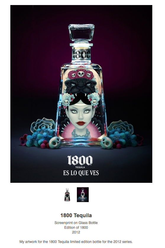 |
| Fig. 1 Tara McPherson Tequila bottle |
Tara has had a huge list of high profile clients such as DC Comics, Warner Brothers, Dark Horse Comics, Fanta, Penguin, Playstation 2, Punk Planet and House of Blues, among many many more. Her art is instantly arresting, Tara creates beautiful and mystical pieces featuring strange and odd women and full of soft complimenting colours.
Tara's work is very popular and she has also begun to make products with her illustrations on them, fig 1 shows and awesome limited edition tequila bottle that Tara has created a piece of art for and then printed on to the bottle. I love this bottle and I think it is utterly beautiful and the colours she has used creates a glowering atmosphere and pulls you in to look more at the amazing art.
 |
| Fig 2, Munny by Tara McPherson |
Above (Fig 2) is a collectors edition of Munny by Tara McPherson, Munny is a very popular collectors item. You can buy them blank and draw on them yourself and they also release artists editions where the chosen artist designs how the Munny looks. I love this Munny by Tara McPherson it is hand painted and all of the profits go to the children effected by hurricane Kartrina.
 |
| Fig 3. Cup and Saucer by Tara McPherson |
Also, so are these cool pillows also by Tara (Fig 4), I love the style she uses and the colours look amazing printed on to the fabric, they are an interesting and different take on the pillow to what we see in day to day life. I think they really stand out and make a statement as well as appease the eye.
I also found this limited edition sweatshirt by Tara (Fig 5), I think it is utterly beautiful and has a soft and feminine atmosphere about it. Tara really understands how to use colour and composition to grab the eye but without a harsh image, her illustrations and soft and beautiful and lovely to look at. I love all of these products, I much prefer the idea of owning things that have been crafted and designed by very, very talented artists. They are set apart to the average household items and stand out.
 |
| Fig 4. Pillows by Tara McPherson |
 |
| Fig 5. Sweatshirt by Tara McPherson |
Bibliography
http://www.taramcpherson.com
http://www.thisisalimitededition.com/artist/view/tara-mcpherson/
http://www.taramcpherson.com/art/
http://www.taramcpherson.com/info/bio
Wednesday, 4 March 2015
Album art research: Sgt. Peppers Lonely Hearts Club Band
Targeting the Youth Market - 50's & 60's
 |
| Fig 1, Album cover for Sgt. Peppers Lonely Hearts Club Band, 1967 |
The album cover started from an ink drawing from McCartney and this was then given to Pop artist Peter Blake and his wife Jann Haworth to design the final layouts and was directed by Robert Fraser and the final cover was photographed on the 30th of March 1967 by Micheal Cooper. The drum in front of the band members was painted by Joe Ephgrave and the collage includes 57 photographs, 9 wax works and the members of The Beatles.
The characters include; Mahavatar Babji, Lahiri Mahasaya, Bob Dylan, Sri Yukswar, Bobby Breen,Paramahansa Yoganda, Marlon Brando, Marilyn Monroe, Aubrey Beardsley, Albert Stubbins, Sonny Liston, Stan Lauren, H.G Wells, Oscar Wilde, Dylan Thomas and Oliver Hardy.
The purpose of having this massive collection of iconic people was meant to show a wide diversity of people who influenced the world to make it the way it was on that day. On the cover is also wax works of The Beatles as how they looked at the beginning of their career next to the real them as they appeared at that point. This showed the audience a huge distinction between who they were and who they came to be in their lives and careers.
This cover cost nearly £3,000 in comparison to most albums back in 1967 which on average cost around £50. Seemingly worth it as this cover came to change album covers forever, it was a huge leap towards new and different covers expressing different things in off beat and new ways.
Bibliography
http://en.wikipedia.org/wiki/Sgt._Pepper's_Lonely_Hearts_Club_Band
The Modern Age: The Influence of the Golden Age
The Golden Age in the UK happened from 1890 to 1920, this was a glorious time for illustrators, and before this time working as an illustrator was not a job title, but in this time the art world boomed and many fabulous artists flourished. One artist in particular that I would like to research is Heath Robinson.
As Heath's career progressed he also wrote and illustrated 3 books of his own, The Adventures of Uncle Lubin 1902, Bill The Minder 1912 (Fig 2) and Peter Quip in Search of a Friend 1922.
In 1902 Heath released his book The Adventures of Uncle Lubin(fig 3), I love the illustrations from this book, they showcase his amazing cartoonist creations and also his complicated machinery illustration. This book is thought to be the first step to his work on complicated and weird machinery.
Heath Robinson really found his forte and passion in creating these weird and wonderful machines, so in 1934 he released a book filled with his favourite illustrations of this sort called Absurdities(Fig 5). This book is filled with his wondrous creations and his favourites from his career.
Among one of Heath's favourites includes The Wart Chair (Fig 6) this contraption is an largely complicated machine thats purpose is to remove a wart from the head. I love Heath's thinking behind his work, his creations and wonderfully complicated for such simple results, I love the childlike thinking in this and the illustrations are so beautiful and clean that its simply far too difficult to just glance at. The complexity of his pieces draw you in to look around and try to understand the contraption and take in the craftsmanship, love and effort Heath Robinson poured in to his work.
Bibliography
W. Heath Robinson was born on the 31st of May 1872 and died ages 72 on the 13th September 1944, in his life he worked as a famous cartoonist and is very we
ll known for his illustrations of complicated machinery.
ll known for his illustrations of complicated machinery.
At the beginning of Heaths Career he illustrated many books such as the following(and many more);
DE LA MARE, W. (1916) Peacock Pie
CHRISTIAN ANDERSEN, H. (1897) Danish Fairy Tales and Legends
KINGSLEY, C. (1915) The Water Babies
SHAKESPEARE, W. (1914 version) A Midsummers Night Dream (Fig 1)
 |
| Fig 1. The Arabian Nights 1899 publication illustrated by Heath Robinson |
 |
| Fig 2. Bill Minder (1912) Heath Robinson |
-('Uncle_Lubin').jpg) |
| Fig 3. The Adventures of Uncle Lubin (1902) Illustration by Heath Robinson |
After Heath Robinson released The Adventures of Uncle Lubin he started to create more and more illustrations that depicted overly complicated machinery that yielded simple outcomes. For example, Fig 4 is an illustration by Heath that depicts a very large and complicated machine that looks as if it is made from odds and ends that peels potatoes. As Heath started to create more illustrations like this he started to become well known, so well known in fact that from around 1914 to 1918 complex machines that created simple outcomes were refereed to as 'Heath Robinson', his name became a slang phrase to describe such creations.
And also during WW2 there was an automatic analysis machine that was created for Bletchley Park to help them decode German message traffic, and this machine was named after Heath Robinson in his honour. This machine is also the direct predecessor to the worlds first programmable digital electronic computing machine.
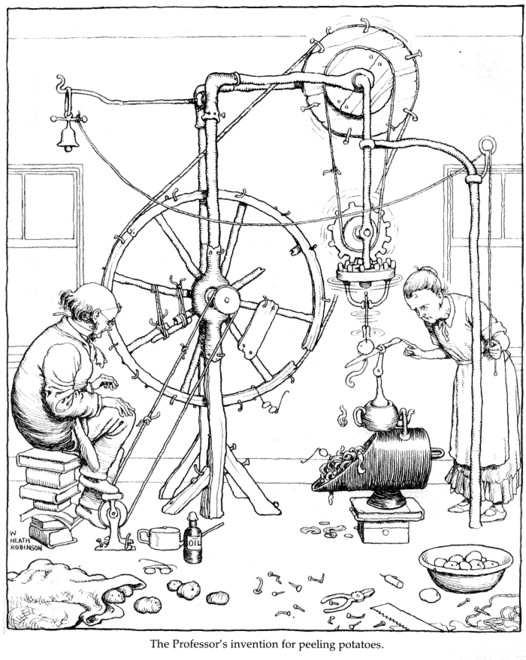 |
| Fig 4, Potato Peeling Machine by Heath Robinson |
 |
| Fig 5, Heath Robinson's Absurdities, 1934 |
 |
| Fig 6, The Wart Chair, Published in Heath Robinson's Absurdities, 1934 |
Bibliography
http://en.wikipedia.org/wiki/W._Heath_Robinson
ROBINSON, H. 1934, Absurdities
ROBINSON, H. 1902, The Adventures of Uncle Lubin
ROBINSON, H. 1922, Peter Quip in Search of a Friend
ROBINSON, H. 1934, Absurdities
ROBINSON, H. 1902, The Adventures of Uncle Lubin
ROBINSON, H. 1922, Peter Quip in Search of a Friend
Material Culture as a National Identity
How did Japanese culture influence Blade Runner?
Blade Runner is a film by Ridley Scott created in 1982, it
is a futuristic epic filled with arresting imagery. I want to look in to this
imagery and analyse how Japanese culture has influenced Ridley Scott in the
making of the film. There are many very clear examples throughout the film that
reflect this in a strong manner. For example, looking at Fig 1 we see the huge
television screen that fills the side of a building with a Geisha like female
smiling. The sheer size of the screen has a very futuristic feel, and I find
this a lot with many Japanese cityscapes, there is a prominent high tech feel
with this film that is a big theme running throughout modern Japan.
 |
| Fig 1. Shot from Blade Runner (1982) Ridley Scott |
 |
| Fig 2. Tokyo Japan City scene (http://theknowledgeplymouth.co.uk/worldwide-tour-tokyo-is-crazy-hectic-and-beautiful/) |
 |
| Fig 3. Blade Runner (1982) Ridley Scott |
Bibliography
SCOTT, R. 1982, Blade Runner (Film)
http://bladerunnerthemovie.warnerbros.com
http://en.wikipedia.org/wiki/Blade_Runner
http://www.imdb.com/title/tt0083658/
Subscribe to:
Posts (Atom)